Reports is where you build the pages you’ll actually share: a report has tabs, each tab is a sheet of metric blocks, and every block stays live — it references a metric from the library, so the numbers are always computed fresh from your data, never copied.
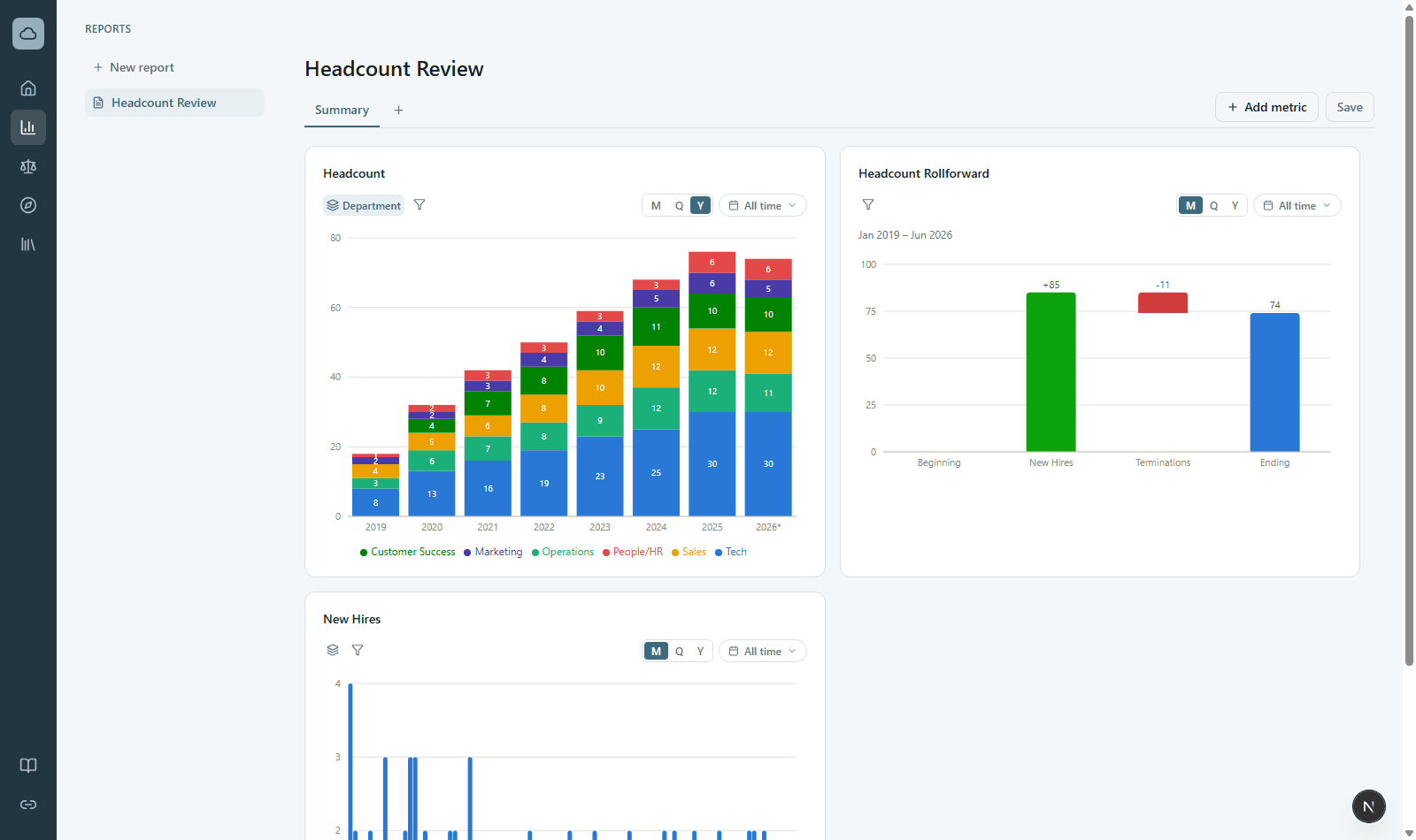
Building a report
- Click + New report in the left rail, then add blocks and pick a metric for each.
- On each block: choose the chart type (icon row in the gear popup), set M/Q/Y granularity, pick a date range, group by a dimension or attribute, and add value filters — the icons live on the block itself.
- Drag blocks by their title to rearrange; drag edges to resize. Double-click a title to rename it.
- Save stores the layout and settings. Date ranges save as presets (“Last 3 months”, “YTD”), so a saved report keeps moving forward in time.
Click any bar, point, or waterfall step to drill straight to the underlying records — for headcount metrics, the actual employees behind the number.
The metric library
Metrics are defined once, centrally, and reused everywhere. The starting library covers headcount: period-end Headcount, New Hires, Terminations, a Headcount Rollforward (beginning + hires − terminations = ending), trailing-12-month Attrition, and Headcount vs. Last Year. Headcount is FTE-weighted — a half-time (0.5 FTE) employee counts as 0.5; with no FTE data every employee is 1.0 and it reads as a plain whole-person count. Every metric’s exact definition is one click away — the ⓘ on any block, or the KPI Definitions page in the Data Library — which you can search, group by dataset, and export like any other table.
Where the numbers come from
Blocks compute from the monthly reporting tables, with your dimension mappings applied. If a chart is grouped by a dimension with unmapped values you’ll see Unassigned as its own group — map those values in the Data Library and every report updates automatically.